GameModHub Gaming
Minecraft Skin Shading Guide
Take any two skins, one that looks professional and one that looks like a first attempt, and the difference is usually not the design. It is that one is shaded and the other is filled.
A Minecraft limb is a rectangular box. Fill it with one colour and it looks exactly like what it is. Give it three tones arranged sensibly and the eye reads it as a shape with volume, even though nothing about the geometry has changed.
Shading at this resolution is not the same skill as shading a drawing. You have very few pixels, no room for gradients, and a viewer who will mostly see the result from several blocks away. What follows is what actually works.
Three tones per material, minimum
For every material on the skin — fabric, hair, skin, metal — pick a base tone, a shadow and a highlight. Three is the working minimum; four gives you more range without turning into noise.
The mistake to avoid is picking those tones by moving lightness alone. A shadow that is simply a darker version of the base looks grey and dead. Real shadows shift in hue as well: warm colours tend toward red or purple as they darken, cool colours toward blue.
Equally, avoid pure black for shadows and pure white for highlights. Both flatten the image and read as holes and glare rather than form. A very dark version of the material's own hue is almost always better.
Light comes from above
Minecraft's lighting is broadly top-down, so shade as though the light source is above the character.
In practice: the tops of shoulders, the top of the head, and the upper surfaces of any accessory catch the highlight. The undersides — below the chin, under the arms, the lower part of each leg — take the shadow. The middle keeps the base tone.
This alone separates the parts of the body. Without it, the head, torso and legs read as one continuous slab of colour, which is the single most common failing in amateur skins.
Be consistent about it. Shading one arm as though lit from the left and the other as though lit from the right is a subtle thing that makes a skin look wrong without the viewer being able to say why.
Do not dither, and do not add noise
Two techniques that work in larger pixel art actively hurt here.
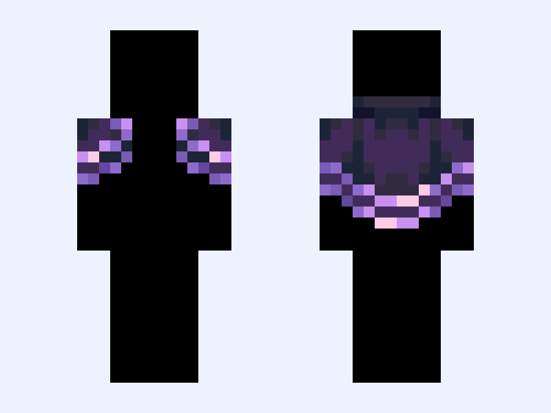
Dithering — the checkerboard of two colours used to fake a gradient — needs room to blend in the eye. On an eight-pixel-wide arm seen at distance it does not blend; it just looks dirty.
Noise — scattering random darker and lighter pixels to suggest texture — has the same problem. What reads as fabric grain at editor zoom reads as static in game.
If a surface looks too plain, the answer is usually more deliberate structure rather than more randomness: a seam, a fold, a hem, a colour break. Something the eye can interpret as an object.
Check it at the size people will see it
Almost every shading mistake is invisible at 800% zoom and obvious at playing distance.
Before calling a skin finished, look at it small. Do the limbs still separate? Does the outfit still read as clothing? Do the shadows still suggest form, or have they collapsed into muddy patches?
Then look at it in poor light. Minecraft spends a lot of time in caves and at night, and a skin with low internal contrast becomes an unreadable silhouette. A palette that looked pleasingly subtle in an editor can vanish entirely underground.
Previewing properly covers how to check this before uploading, and the skin-making guide covers the surrounding workflow.